为Hexo-Fluid自定义一些效果
写在前面
萌新跌跌撞撞终于把博客弄好了,但发现根本不知道写些什么,,博客就这样吃灰了大半年(哭。
这个假期我心血来潮,决定抄一抄搞一搞博客。
修改完后执行下述代码以部署:
hexo clean
hexo g
hexo d建议在hexo d部署之前执行下述代码,本地调试一下,网站会在http://localhost:4000启动。调试时,修改部分内容(似乎是文件名前有_的会忽略掉)不需要重新hexo g,重新刷新页面即可生效
hexo s自定义滚动条1
效果见右侧滚动条(不支持Firefox和Internet Explorer)
- 在
博客目录\themes\fluid\source\css中新建scrollbar.css
/*定义滚动条高宽及背景 高宽分别对应横竖滚动条的尺寸*/
::-webkit-scrollbar {
    width: 4px;
    height: 4px;
    background-color: #181C27;
}

/*定义滚动条轨道 内阴影+圆角*/
::-webkit-scrollbar-track {
    box-shadow: inset 0 0 6px rgba(0,0,0,0.3);
    -webkit-box-shadow: inset 0 0 6px rgba(0,0,0,0.3);
    border-radius: 10px;
    background-color: #181C27;
}

/*定义滑块 内阴影+圆角*/
::-webkit-scrollbar-thumb {
    border-radius: 10px;
    box-shadow: inset 0 0 6px rgba(0,0,0,.3);
    -webkit-box-shadow: inset 0 0 6px rgba(0,0,0,0.3);
    background-color: #AAA;
}

/*鼠标在滑块上方时滑块变色*/
::-webkit-scrollbar-thumb:hover {
    background-color: #808080;
}
- 在Fluid主题配置文件中添加自定义CSS(195行处)
custom_css:
- /css/scrollbar.css首页图片动画2
- 在
博客目录\themes\fluid\source\css中新建indeximg-hover.css
.index-img {
  transition: .4s;           /*动画时间*/
}
.index-card:hover .index-img {
  transform: scale(1.05);    /*放大倍数*/
}- 在Fluid主题配置文件中添加自定义CSS
custom_css:
  - /css/indeximg-hover.css
自动翻译标题至英文标题
npm install hexo-translate-title --save- 在hexo根目录的
_config.yml中添加以下代码
translate_title:
  translate_way: google              # google,youdao,baidu_with_appid,baidu_no_appid
  youdao_api_key: ''                 # Your youdao_api_key
  youdao_keyfrom: xxxx-blog          # Your youdao_keyfrom
  is_need_proxy: false               # true | false
  proxy_url: http://localhost:50018  # Your proxy_url
  baidu_appid: ''                    # Your baidu_appid
  baidu_appkey: ''                   # Your baidu_appkey
rewrite: false # is rewrite true | false - 修改
_config.yml中的permalink项,将title替换为translate_title
permalink: :year/:month:day/:translate_title.htmlTwikoo评论样式修改
按照官方文档部署完Twikoo之后,发现默认的评论框高度比较低,没有相关配置选项,所以去找了一下,发现Github有相关问题issues#106,开发者的回应是
由于Tiwkoo的配置项存在数据库,加载配置有一个延时,经过尝试,将评论框高度放到配置项中,会导致评论框跳动,体验不佳,所以不再考虑评论框高度配置,建议通过外部CSS控制评论框高度。
那么就开干吧,在老位置新建twikoo.css,并添加到自定义CSS中
修改评论框高度
开发者给出了相关CSS,实测下来,没什么问题,可以根据自己的喜好更改min-height。添加以下代码:
.twikoo .tk-submit .el-textarea__inner {
  min-height: 150px !important;
}
去除末尾”Powered by Twikoo”
保留技术支持信息是有必要的,但是为了简洁,还是想办法去除了。你我知道Twikoo赛高就可以了哈
.tk-footer {
    display: none;
}
为评论框背景图添加动态效果
配置中可以插入自定义图片(静态/动态),但是不能调整位置,而且当打字时有可能会挡住文字,所以参考资料3做出了下面的效果
代码如下:
.twikoo .tk-submit .el-textarea__inner {
    background-position: right 2.5% bottom 0 !important; /*自定义原始位置*/
    transition: all 0.5s ease-in-out 0s !important;      /*动画时间*/
}
.twikoo .tk-submit .el-textarea__inner:focus {
    background-position-y: 240px !important;             /*自定义点击时的位置*/
}
后来偶然看到Chrome的F12开发者工具里能调贝塞尔曲线,好像发现了新大陆
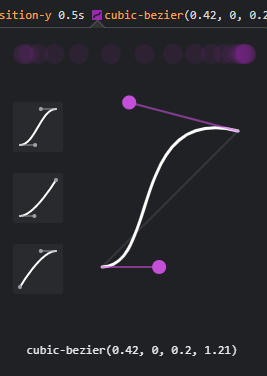
于是稍微修改了一下代码,有了下面的效果
总的代码如下:
.tk-footer {
    display: none;
}
.twikoo .tk-submit .el-textarea__inner {
    min-height: 210px !important;
    background-position: right 2.5% bottom 0 !important;
    background-size: 50px 56px !important;
    transition: all 0.3s cubic-bezier(0.42, 0, 0.76, 1.02) 0s, background-position-y 0.5s cubic-bezier(0.42, 0, 0.2, 1.21) 0s !important;

}
.twikoo .tk-submit .el-textarea__inner:focus {
    background-position-y: 240px !important;
    background-size: 10px 56px !important;
}
Mac风格代码块4
已经不记得是在哪里复制的代码了,当时直接使用效果不太对,乱调了一通,还是不太懂是怎么实现的,想来想去还是把代码贴出来吧
.code-wrapper {
    position: relative;
    overflow: hidden;
    border-radius: 5px;
    box-shadow: 4px 4px 5px rgba(0,0,0,0.2);
    margin: 25px 0;
    padding-top: 14px;
  }
  .code-wrapper ::-webkit-scrollbar {
    height: 5px;
  }
  .code-wrapper ::-webkit-scrollbar-track {
    -webkit-box-shadow: inset 0 0 6px rgba(0,0,0,0.3);
    box-shadow: inset 0 0 6px rgba(0,0,0,0.3);
    height: 5px;
    border-radius: 10px;
  }
  .code-wrapper ::-webkit-scrollbar-thumb {
    border-radius: 10px;
    height: 5px;
    -webkit-box-shadow: inset 0 0 6px rgba(0,0,0,0.5);
    box-shadow: inset 0 0 6px rgba(0,0,0,0.5);
  }
  .code-wrapper::before {
    color: #fff;
    content: attr(data-rel);
    border-radius: 5px;
    height: 25px;
    line-height: 30px;
    background: #21252b;
    color: #fff;
    font-size: 16px;
    position: absolute;
    top: 0;
    left: 0;
    width: 100%;
    font-family: 'Source Sans Pro', sans-serif;
    font-weight: bold;
    padding: 0 80px;
    text-indent: 15px;
    float: left;
  }
  .code-wrapper::after {
    content: ' ';
    position: absolute;
    -webkit-border-radius: 50%;
    border-radius: 50%;
    background: #fc625d;
    width: 12px;
    height: 12px;
    top: 4px;
    left: 10px;
    margin-top: 4px;
    -webkit-box-shadow: 20px 0px #fdbc40, 40px 0px #35cd4b;
    box-shadow: 20px 0px #fdbc40, 40px 0px #35cd4b;
    z-index: 3;
  }
  .code-wrapper > pre {
    margin-bottom: 0;
  }
  :not(pre) > code[class*="language-"],
  pre[class*="language-"] {
    background: #322931;
  }
  code {
    color: #c4c6c9;
  }
  pre.language-none {
    padding-left: 15px;
  }
  .copy-btn {
    top: 0.3rem!important;
  }
参考
为Hexo-Fluid自定义一些效果
https://forsure.live/customize-some-effects-for-hexofluid/